
Do you have a piece of artwork ready for printing, but are unsure as to what format it should be in?
What on earth is bleed and why do you need crop marks?
There are a number of things you need to think about when preparing your artwork for print. Here is a quick step by step guide.
- What software to design your marketing item in?
- Set up your document correctly
- Remember to allow for bleed and crop marks
- Use the right colour type
- Check the image resolution
- Fonts
- Saving your artwork
- Export artwork for print
1. What software to design your marketing item in?
Professional DTP software
(e.g. InDesign, Quark XPress)
DTP (desktop publishing) software is specifically designed to prepare documents with a view to having them printed on press. They work alongside a family of graphics and imaging programs, e.g. Photoshop and Illustrator. We each have our own preferred software, many of which we can accept. However, our preferences are as follows:

For artwork documents and projects
Artwork to be created in Adobe InDesign or Quark XPress and export to print ready PDF (i.e. brochures, stationery, exhibition panels, postcards etc:)
Vector Graphics
Artwork to be created in Adobe Illustrator (i.e. logos, background graphics)
Photographs
Artwork to be created in Adobe Photoshop
(i.e. scanned images, digital photography, photo montages etc:)
Adobe PDF (Portable Document Format)
PDF is now the industry standard method for submitting artwork for printing, because it generates smaller (i.e. portable)
2. Set up your document correctly
Document set-up
When setting up your document the page size must be the exact size of the trimmed and finished object. There are exceptions such as folders and items that include multi-folds but we will be happy to advise you about those on an individual basis.
The document size must not include additional measurements for bleed or crop marks, as they must exist outside of the printing area. In software such as InDesign when you are creating the document, it gives you the opportunity to add bleed separately to the document size using additional options.
3. Remember to allow for bleed and crop marks
Bleed & Crop Marks
Bleed this one is important – and often overlooked.
A bleed is where an image or background colour is positioned so that it prints right to the edge of the page. If you’re working on a document that has bleeds you need to make the object that bleeds off the page overlap the edge of the page by at least 3mm. Without bleed, when the job is trimmed, you will be left with a white edge to your printed item.
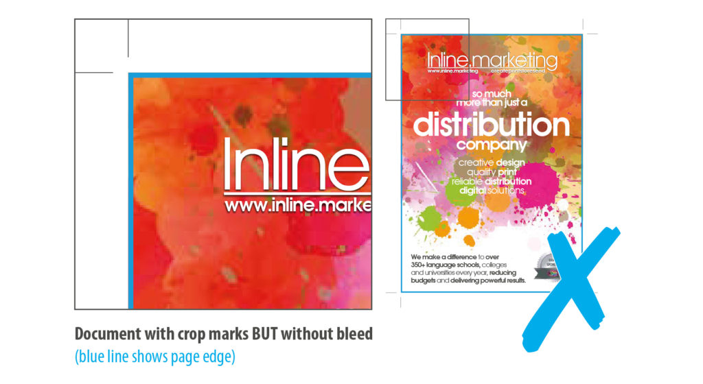
Document with crop marks BUT without bleed
(blue line shows page edge)
Crop marks, also known as trim marks or registration marks appear at the corners of your artwork and are an indication to the print finisher of where to trim your job. When artwork is supplied in its original form, as a native InDesign or Quark file, we will add the crops marks when we output the job. If you are supplying a print ready pdf however, you must ensure the crop marks are already in place on the file when you send it to us.
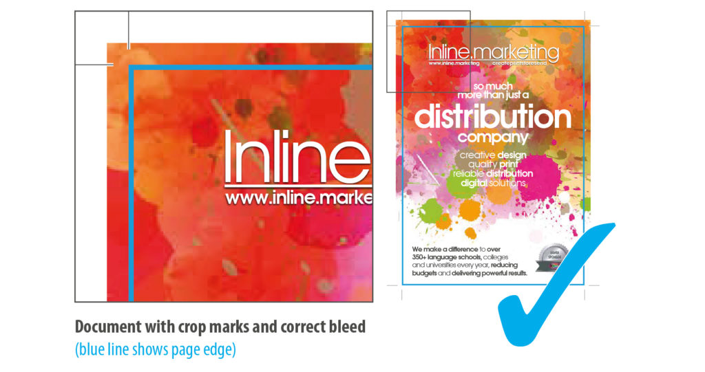
Document with crop marks and correct bleed
(blue line shows page edge)
4. Use the right colour type
Colour
The most important thing to remember when setting up your artwork is that what you see on your screen is not a good enough reference for what will print. All you have to do is fiddle with the brightness and contrast on your screen, and suddenly the colours are displaying differently.
There are several ways in which computers handle colour in picture files, the main two colour modes being RGB (red-green-blue) colour and CMYK (cyan – magenta – yellow – key black) colour. RGB colour is based on properties of light, and is suitable when images are to be viewed on screen, not for printing with ink or toner on paper. CMYK colour is based on properties of ink and should always be used when a colour image is to be printed. The colour mode of your graphics files can be set to CMYK from within your graphics program; the colour mode of your document text can be set from within your DTP program . For the best results you need to match your colours to something more reliable like a Pantone reference book or CMYK mixer chart. The secret is to trust your eyes rather than your screen.
It is also key to remember that if it’s printing in CMYK you must choose and set your colours using CMYK. Artwork supplied in RGB and then converted to CMYK can throw up unexpected results. The same rule applies for Pantone, although Pantone colours can sometimes be matched almost exactly by CMYK some, once converted, can differ drastically.
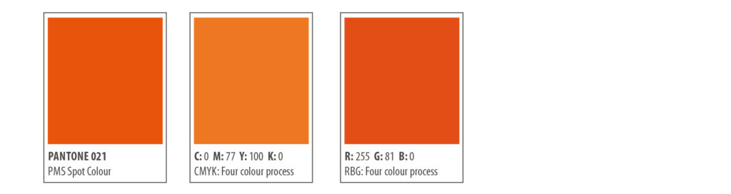
Pantone colour 021 orange converted to CMYK and RGB
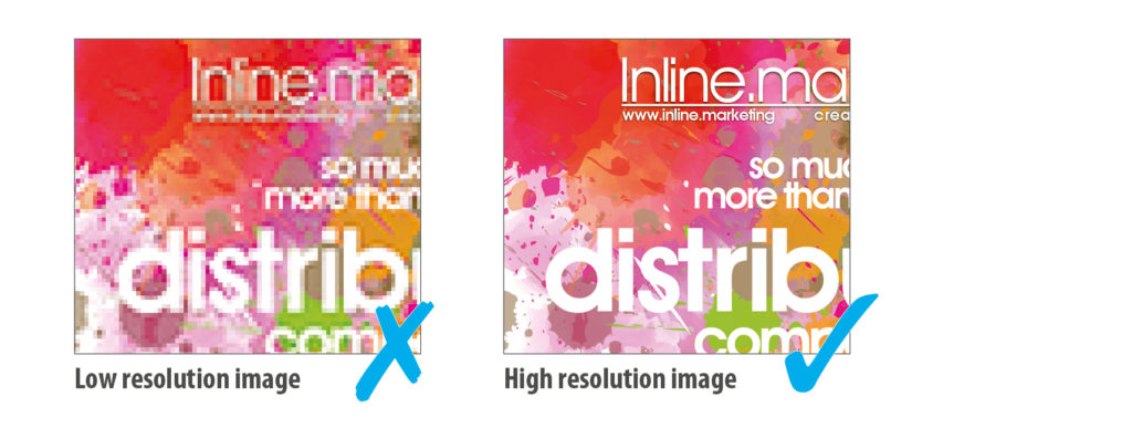
5. Check the image resolution
Printing digital images. Printing digital images can be frustrating if you don’t have an understanding of print quality versus screen quality. A screen quality image, which looks fine on your monitor, will often look pixellated when you print it.
Resolution. What is it? In simple terms its the number of dots within an area or line, usually dots per inch (dpi) or pixels per inch (ppi), to be used when printing the image. You can resample an image to change the number of pixels and therefore the size or resolution of the image, but they must maintain a consistent relationship. As size is increased the resolution decreases and vice versa. If you attempt to increase the resolution independently of the size you are in effect just cloning existing pixels, this will not increase the quality of the image.
The higher the dpi the better the quality of the image when printing. By taking images from websites, not only are you breaking copyright laws if you don’t own the originals, but you are also more than likely downloading a low resolution image. Web designers decrease image size and resolution to around 72dpi to make viewing them on the internet speedier. This is suitable for screen viewing (known as screen resolution) but the results for printing are disappointing and will often lead to pixelation of the image, no matter how much you enlarge or reduce the size of the picture on the page.
We require a minimum resolution of 250dpi for Litho printing. We can produce suitable results with less resolution for Digital printing. Once you have your 250-300dpi image, it must be placed at no more than 100% size in your document. A 300dpi image placed at 150% actually decreases the print resolution to only 200dpi. Remember the size and resolution are relative, as the size goes up the resolution comes down.
Vector images aren’t resolution dependent, which is why we encourage their use wherever possible. For example if you have a logo as a vector graphic, you can resize the image to print at almost any size without the quality deteriorating.
6. Fix your fonts
Fonts
Fonts can be tricky.
Supplying PDF print ready artwork. You can choose to embed all the fonts you have used in your PDF when you create it. If you do this, it won’t matter whether we have the fonts you have used or not – the PDF will contain enough information to make sure that your fonts print out correctly.
Supplying DTP file: If you have created your artwork using a font that we don’t hold in our extensive font library, we will be unable to output your job. It is important that you include the relevant fonts when you send us your artwork. The best way to do this is to perform a ‘collect for output’ or ‘package’ your job. This will create a folder that contains your document, all the links (i.e. graphics and images) and your fonts .
There are licensing laws that prevent you from sharing your fonts with other users, as each set must be purchased for individual use. However we do not take copies of your fonts for personal use and therefore no laws are broken. The supplied fonts are used for the express and sole purpose of outputting your job and then discarded.
Another way around the font issue is to convert all your text to paths. This removes the font information from the document and treats the text as a vector graphic. Remember, if you choose this route you must save a copy of your document with the fonts first, as once the text has been converted to paths and the document saved you will be unable to undo this or edit any of your text. ALWAYS create two separate documents so you can go back and edit your text if needed.
7. Saving your artwork correctly
Gather together all elements correctly
Saving your artwork correctly for future edits or if you need to send original design files to us for studio edits or printing.
Gather together all the elements required to correctly print the document (document, graphics and fonts) and put them in an output folder along with a report detailing the contents. It is highly recommended that you use this tool when sending DTP files for printing. Most DTP programs have a handy utility which ensures that you supply all the necessary files every time. In Quark XPress it’s called “collect for output”; in InDesign it’s called “package”.
This means that there are 3 different elements which you must provide in order to print your job correctly:
1.The document (i.e. the DTP file); Indesign
2.The graphics/links (i.e. all the pictures, logos, etc. as separate image files);
3.The fonts.
8. Exporting artwork for print
PDF (Portable Document Format)
PDF is now the industry standard method for submitting artwork for printing, because it generates smaller (i.e. portable) files and, when used correctly, it ensures that all graphics and fonts are properly embedded so that they will print correctly no matter what computer you print them from. Nowadays many programs have a PDF writer built in, but this is not always the case. Where this is not the case, you will need to have access to DTP software which allows you to create PDF files – from Indesign or Quark Xpress, or whatever program you have used to set up your document.
A PDF that has been created correctly can be output in a quarter of the time of standard artwork. If however, the PDF is not what we call ‘print ready’ and requires intervention from our mac operators, or editing by the customer themselves, the process can be lengthened indefinitely.
The intention of the pdf workflow is for the customer to provide a ‘print ready’ PDF that includes bleed and crop marks (see step 3) and is high resolution. The file must also be proof passed by the client so as to minimise the chance of there being any amendments.
Your PDF must be centred with crop marks, all fonts must be embedded, images must be a minimum of 300dpi, no RGB or LAB colour profiles and all pages must be supplied as single pages not spreads or printers pairs.
Where possible we will avoid making amendments to PDF’s as we risk the introduction of errors by altering the file.
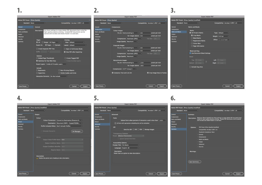
The following screen shots below should be noted when generating PDF files from DTP Software: Indesign
1.Choose the right quality setting: Most PDF writers will give you some kind of choice as to what level of quality you want your PDF to be. Look for “print quality”, “press quality” or “high quality” and 300 dpi resolution or more.
Export as single pages: There are exceptions such as brochure cover that include a spine and items that include multi-folds but we will be happy to advise you about those on an individual basis.
2.Compression: This will be pre-set for you, if you select the correct “press quality” setting.
3.Add crop marks & bleed: Making sure your DTP document has been set-up correctly. See steps 2 & 3.
4.Output: CMYK output
5.Advanced: Embed your fonts
6.Summary: Checklist.
Checklist: While creating, or before supplying your artwork, check through this simple list to make sure you haven’t missed anything.
- Correct document size
- Min. 3mm bleed Crop marks
- Correct colour mode
- High resolution images
- Package/Embed fonts
- Package artwork
- Export print ready PDF
For more information or further advice, contact us on +44(0)20 7231 8000 or email [email protected]
